Tinting a background image with transparency in CSS
I was recently working on a small website for one of my client's therapy practice, the design of which was inspired by a painting art style. In order to allow the client to change the colors of the website themselves, I wanted to make the textures of the design in greyscale and then tint it via CSS. This turned out to be more complicated than I expected, and I didn't really find a lot of people discussing this topic online. I've decided to write out my approach to tinting a background texture which has transparent parts in the hopes that this article will help developers working on the same issue.
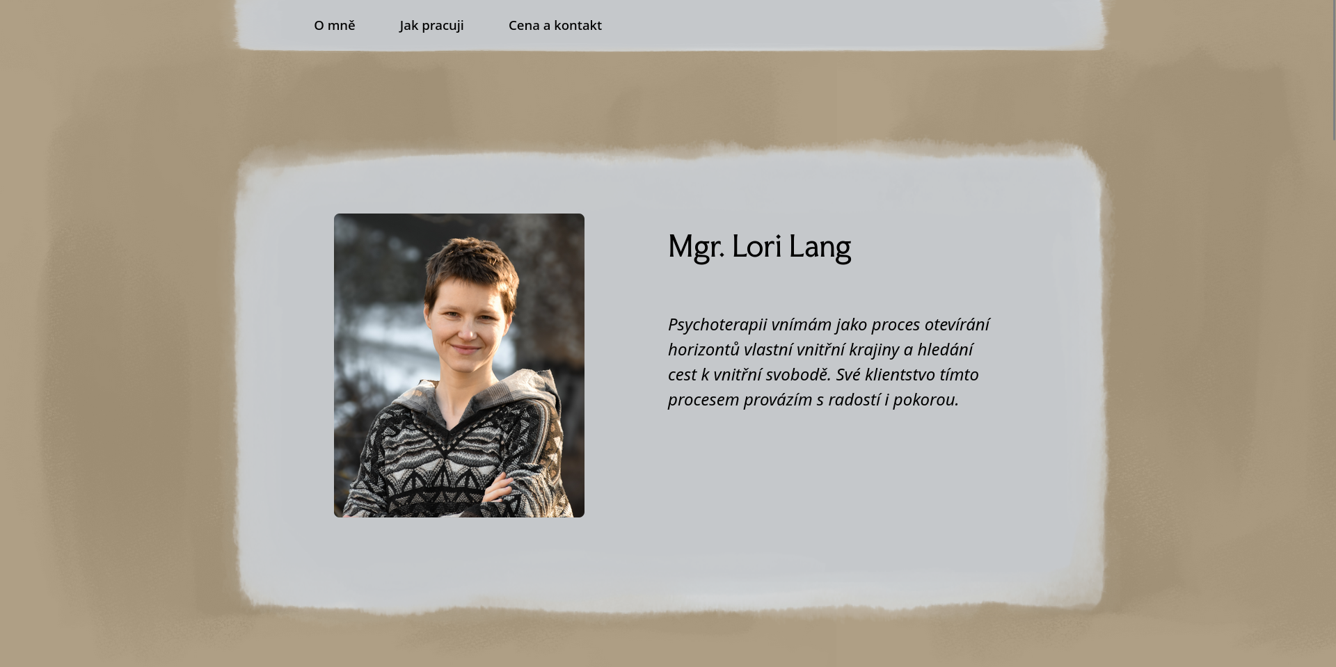
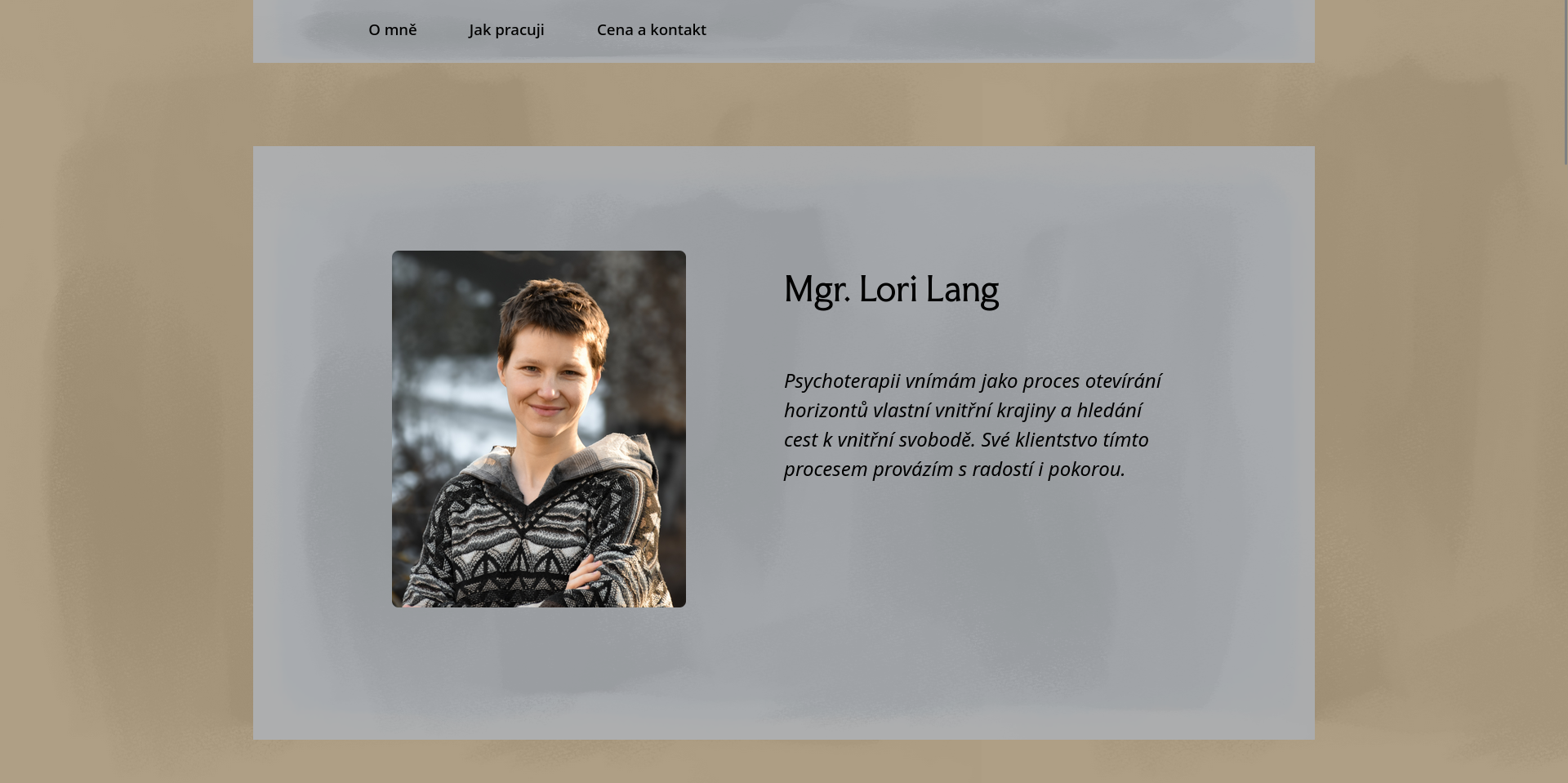
This article uses several screenshots of the website. Since the website is live now, it can also be found here.
Both of the textures used on the website and discussed in this article were painted by Petr Eduard Klouda. Go check out his Instagram to see some of his art!
The website's background
The background of the entire website is the easier part, as it does not have any transparency around the edges. This is the texture used for the background:
The HTML code of each page contains a <div> element that serves as the background image, positioned right before the end of the <body> tag:
<div class="background-overlay"></div>
Having this be a separate element rather than setting the background-image on, for example the entire <body>, ensures that the tint we will apply to it won't tint the other elements on the page, such as images. This .background-overlay element is then edited in the CSS to stretch over the entire page and be positioned behind all the other elements:
.background-overlay {

	/* Change color for website background (in RGBA, the gradient should contain the same color twice). */
	/* Adapted from Chris Coyier, https://css-tricks.com/tinted-images-multiple-backgrounds/. */
	background: linear-gradient(RGBA(255, 174, 45, 0.2), RGBA(255, 174, 45, 0.2)), url('../images/background.png');

	position: fixed;
	top: 0;
	left: 0;
	width: 100%;
	height: 100%;
	background-size: contain;
	background-repeat: repeat;
	z-index: -1;

}
The position: fixed attribute makes sure that the background texture does not move on scroll. This is a stylistic choice as much as a technical one -- the background texture is so faint that it not moving doesn't look visually bad. For this approach to work with background-repeat: repeat, the texture has to be seamless. In our case, this just meant that all four edges have to be the same solid color.
As mentioned in the comment in the code, the tint for this part was adapted from Chris Coyier's article, Tinted Images with Multiple Backgrounds. This approach works well here without any tweaks, but it won't work in the next section.
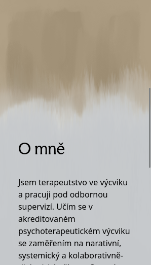
The sections' background
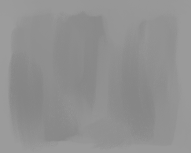
The texture for the individual sections of the webpage is more complicated. I've copied the texture below, filling the background with color. On the actual website, only the greyscale texture is used, with the colored parts being fully transparent:

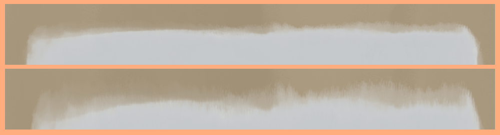
As you can see, the edges of this texture are transparent. This is a problem for the aforementioned linear-gradient approach, because setting the top layer of the background to the solid color (or color gradient) will tint the entire area of the element, including the transparent bits, like so:
Because of this, we need to take a different approach. First, we just set the background image to be the texture that we want, sizing and positioning it correctly:
.block {
	background-image: url('../images/block.png');
	background-size: 70% 100%;
	background-repeat: no-repeat;
	background-position: center top;
}
For actually tinting it, we need to use masks. We use the ::after pseudo-element to use the background image itself as a mask for the tint. We have to make sure that the -size, -position, and -repeat settings are the exact same on the mask as on the background:
.block::after {

	/* Change color of block background. */
	background-color: rgb(247, 251, 255);

	mix-blend-mode: multiply;

	content: "";
	position: absolute;
	top: 0;
	bottom: 0;
	left: 0;
	right: 0;

	pointer-events: none;

	mask-size: 70% 100%;
	mask-repeat: no-repeat;
	mask-position: center top;
	mask-image: url('../images/block.png');

}
Setting the mask image ensures that the tint is only applied in the exact area of the background image. This way, none of the element around the actual solid parts of the image is tinted.
It is notable that, because the textures have a light grey color, the color that is actually displayed on the page will be slightly different from the one set in the CSS, because the two colors mix. To achieve the result you want, you need to experiment a bit. Also, since the top and bottom edges of the texture are uneven, this creates variety when the images are stretched to fit different amounts of content. This makes it look like there are multiple different images used, even when there's only one:
On smaler screens, I set the background-size and mask-size in the appropriate elements to 150% width in order to remove the padded edges of the blocks, as seen below:
Conclusion
These are two approaches that you can take to tint a background image. The first one isn't anything new and is very simple, but breaks if the background image has transparent parts in it. The second approach is something I had to figure out myself; I hope that it will be useful to you!
Thanks for reading this article by Tadeas Jun! Have any thoughts, feedback, or just want to chat? Contact the author at contact@tadeasjun.com, or on Discord at @tadeasjun. Tip them on their PayPal or hire them as a world designer, writer, or software engineer via their Portfolio page.